Risk Exposure
Use the risk exposure histogram to view risk exposure. It is driven by the activity or summary that you select in the activity panel.
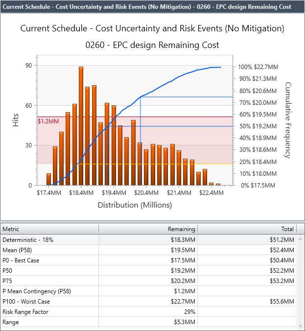
The histogram displays both a cumulative and non-cumulative chart showing the distribution of duration, cost, float, start, or finish dates for the selected activity.
Probability Values and Contingency
You can add probability values (P-values) to the chart by clicking in the chart in the desired location and selecting one of the Add/Remove P-value options. Each time you add a new P-value to the chart, Acumen Risk automatically adds the P-value data to the table beneath the histogram as a column to the main activity spreadsheet.
In addition, you can graphically plot contingency (the difference between a deterministic value and a P-value) by clicking in the chart in the desired location and selection one of the Add/Remove contingency options. Positive contingency is highlighted in red, negative contingency (that is, when your estimate has too much contingency built into it) is highlighted in green.
The contingency duration unit is based on the workbook duration time unit setting.
When you look at risk exposure for cost, the grid below the graph displays the name of each metric with remaining and total costs. Total cost equals actual + remaining + contingency for the Pxx value the row represents. When you publish an Executive Briefing report, the risk exposure data refers to the total cost.
The Pxx Cost columns in the S3 // Risk tab Activities grid for an in-progress activity represent the risk-adjusted total cost which is equal to the actual cost to date + the risk-adjusted remaining cost.
Example of a Risk Exposure Chart with Positive Contingency Highlighted